Themes
The Theme section of each Site menu allows you to select the theme for your site, and to set theme-specific settings. Each site on your Omeka S installation can have a separate theme and numerous customizations. A fresh Omeka S install comes with one theme, called Default.
Installing themes
Pour apparaître dans l’onglet Thèmes des sites, les thèmes doivent être manuellement ajoutés au dossier themes de l’installation, en utilisant un programme FTP ou une connexion SSH.
Pour ajouter un thème au site en utilisant FTP :
Téléchargez le thème zippé sur votre ordinateur.
Ouvrez votre client FTP, connectez-vous au serveur qui héberge l’installation Omeka S et naviguez vers le dossier
/themes(il doit être situé dans le dossier principal de l’installation).Upload the zipped theme to the
/themesfolder.Dézippez le thème.
You can delete the zipped file if it remains on your server.
When you navigate to the Themes page of the Sites menu, you should see your newly added theme represented there.
!!! note
The folder that appears in the /themes folder should show the name of the theme, without any version numbers. If you are having issues installing a theme, check that you have unzipped the theme correctly, without creating extra folder levels.
You can also use SSH to clone a theme directly from that theme’s git repository. Do this only if you are comfortable with git, GitHub, and working with SSH. You can find links to each theme’s GitHub repository on our website’s Themes directory - click on a theme and look above the version history table.
To uninstall a theme, simply delete the folder from the /themes directory in your Omeka S installation. All settings on that theme, from all sites, are saved elsewhere and will not be deleted. This means you can reinstall the theme again at a later date and recover your settings.
To update a theme:
Download the new version of the theme you would like to update.
Open your FTP client and log on to the server that houses the Omeka S install. Navigate to the
/themesfolder.Move the old copy of the theme to your computer.
Upload the zipped folder for the latest version of the theme to the
/themesfolder.In your FTP client, unzip the new version theme.
On the Omeka S installation dashboard, go to a Site, then to the Themes page, and verify that you are seeing the new version of the theme.
Check to be sure your settings have been preserved and there are no errors. After this, you can safely delete the old theme folder that you saved to your computer.
Selecting a theme
Currently installed themes will be available for selection in the process of adding a new site. Click to the « Theme » tab before saving to select one, then save your site. If you do not select a theme, your new site will use the Default theme.
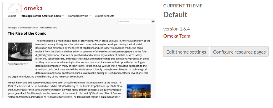
When you navigate to the Theme screen of a site, the currently active theme will appear on the top of the page.
A large image of the active theme appears on the left, with the theme title, version, creator, and two buttons to the right: « Edit theme settings » and « Configure resource pages ».
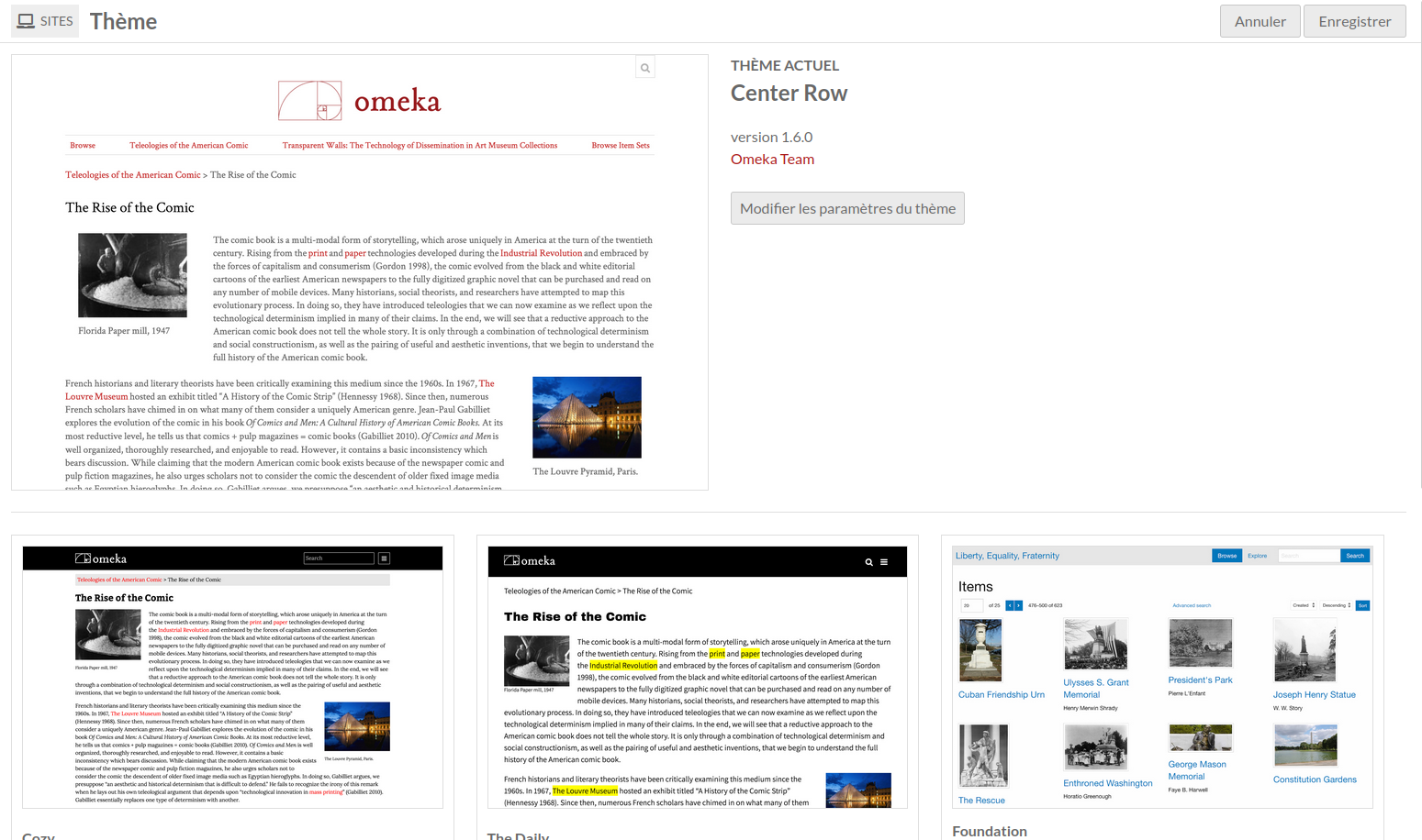
Sous le thème actuel se trouvent des boutons pour tous les autres thèmes installés. Les boutons ont une petite image du thème, le nom du thème et un lien vers le créateur du thème.
To switch themes, click on the theme you want to use. It will highlight slightly in gray, with a checkbox in the lower right-hand corner of the theme tile.
Cliquez sur le bouton « Enregistrer » dans le coin supérieur droit de la fenêtre pour sauvegarder les modifications. Cliquez sur le bouton « Annuler » pour partir sans enregistrer les modifications.
Once you have selected a new theme and saved the page, you will have the options to « Edit theme settings » or « Configure resource pages » for that active theme.
Edit theme settings
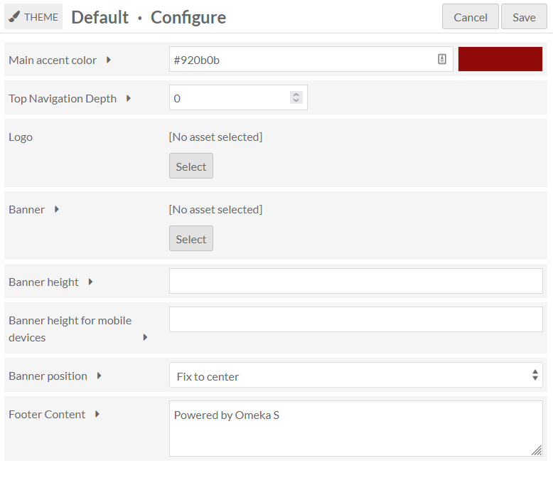
Les paramètres du thème vous permettent de personnaliser l’aspect du thème du site, par exemple en ajoutant un logo, ou en rédigeant un texte de pied de page.
Pour modifier les paramètres de votre thème sélectionné, cliquez sur le bouton libellé « Modifier les paramètres du thème » à droite de la vignette du thème actuel.
Note that your settings for a specific theme on a site will be saved when you change themes. For example, if you customized the footer for the default theme, then switched to using The Daily for a while, then switched back to the default theme, your custom footer will still be there.
Options de paramétrage
Selon le thème que vous avez sélectionné, vous pouvez voir certaines des options suivantes :
Logo
(Tous les thèmes)
Téléchargez une ressource (un fichier) comme logo dans l’en-tête de votre site. Les types de fichiers autorisés sont : jpg, gif, png, svg, et svgz.
Cette ressource n’est associée à aucun des contenus, et sera stockée séparément ; une fois téléchargée pour un site vous pourrez le sélectionner à nouveau sans la re-télécharger, même si vous changez de thème. Toutes les ressources téléchargées pour un site seront disponibles pour tous les sites de l’instance.
Pour télécharger un logo, cliquez sur le bouton Sélectionner. Cette action ouvre une barre latérale où vous pouvez soit télécharger un nouveau fichier depuis votre ordinateur, soit choisir parmi les ressources déjà téléchargées.
Notez que le logo remplace complètement l’en-tête, y compris le titre du site, pour le site, donc envisagez une image avec du texte si vous souhaitez que les utilisateurs voient le titre du site.
To remove a logo, click the « Clear » button in that block (only visible when a logo is active) and save your changes.
Color selection
(Défaut, Cozy, The Daily)
Les thèmes Défaut, Cozy, et The Daily incluent une option pour saisir des valeurs pour la couleur d’emphase principale ; Cozy a aussi une option pour la couleur d’arrière-plan de la navigation.

La couleur d’emphase principale est utilisée pour les liens texte et les couleurs de survol, comme dans l’image ci-dessous :
La couleur d’arrière plan de la navigation définit la couleur de la barre latérale de navigation pour le thème.
Modifiez le champ en saisissant une valeur de couleur : soit un triplet soit un code hexadécimal. Une fois que vous avez saisi une valeur valide, la barre de couleur sur la gauche sera automatiquement mise à jour pour afficher la couleur saisie, même sans enregistrer les changements.
The default values are stored in the prompt text for the field. For the Cozy theme, the main accent color is 087b94 and the navigation background color is bfdcdc.
Disposition des pages de navigation
(Center Row, Foundation)
Sélectionnez comment afficher les contenus à l’intérieur des vues de liste.
Grille : Les contenus sont organisés en lignes et colonnes. Recommandé pour les contenus qui présentent des images.
Liste : Les contenus sont empilés en une seule colonne.
Toggle (default grid): Site visitors can choose to display the browse views as grids or lists, with grids as the default.
Toggle (default list): Site visitors can choose to display the browse views as grids or lists, with lists as the default.
Paramètres du thème Foundation
Foundation est un thème qui vient avec quelques feuilles de style par défaut pour un prototypage rapide ou pour débuter avec la modification de thèmes. Par conséquent, il a des paramètres uniques. Pour plus d’informations sur l’utilisation de Foundation, y compris l’utilisation de Sass, voir le fichier Readme du thème.
Paramètres non décrits ci-dessus :
Feuille de style : Le thème propose 4 options de style. * Défaut* utilise les styles par défaut de ZURB Foundation, tous visibles dans leur documentation sous Kitchen Sink. * Revolution reproduit l’effet de documents anciens avec des accents rouge vif. * Sea Foam offre une palette bleu sarcelle, propre et accueillante. * Inkwell propose une typographie serif contrastée et des accents jaunes.
Navigation layout: Global navigation can display as a horizontal top bar with optional dropdown menus or a left vertical column.
Afficher les pages enfant de la navigation supérieure : Active l’affichage des pages enfants dans la navigation principale. Si non cochée, seule la navigation de premier niveau sera affichée.
Metadata Layout for Show Pages: Resource metadata can show display as stacked with properties as headings above their values, or inline with properties as headings inline with their values.
Tronquer la propriété de corps : Définit quelle portion de la propriété de corps est affichée sur la page de liste. Vous pouvez :
Afficher la valeur complète qui affiche tout le texte de la propriété.
Afficher 4 lignes et s’estomper qui affiche 4 lignes de texte avec un fondu à la fin du bloc de texte.
Afficher 4 lignes et des points de suspension qui affiche 4 lignes de texte finissant par une ellipse (…).
Configure resource pages
Within a site it is possible to configure the blocks of content that appear on the resource pages: the item page, the media page, and the item set page.
Individual themes will define the available regions (for example, Main or Sidebar) where blocks may be placed. Some themes may not offer these options.
These settings are available to site Managers, as well as installation Supervisors and Global Administrators.
When on the Theme page of a Site, your current theme will appear at the top, with two buttons on the right: « Edit theme settings » and « Configure resource pages. » Select the « Configure resource pages » button to modify how these pages will display in this theme.
Note that your settings for a specific theme on a site will be saved if you change themes. For example, if you customized the item page for the Default theme, then switched to using Foundation for a while, then switched back to the Default theme, your item page settings would be retained.
Selecting regions and blocks
In the right sidebar, select a region from the dropdown menu, and then add a block to it from the list of available blocks by clicking on the block name. Blocks may be reordered or moved to other regions by dragging and dropping.
To remove a block, click the delete icon and then save the page. It will once again appear in the right sidebar.
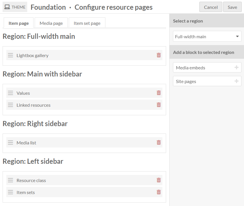
The image below shows the « Configure resource pages » screen with the « Item page » tab selected. The right sidebar includes a dropdown menu to select a region and a list of the remaining possible blocks to be added to the page. The Foundation theme is being used and there are four regions: Full-width main, Main with sidebar, Right sidebar, and Left sidebar.
If you put no content in a specific region, such as a sidebar, it will not appear, and the other regions will expand to occupy the space.
You can use the CSS Editor module to modify the relative widths or other display properties of regions you choose to use, such as setting different background colors, adding borders, or configuring separate text styles. Use your browser inspection tool to identify regions to call: for example, in the Foundation theme, the regions are .full-width-main, .left-sidebar, .main-with-sidebar, and .right-sidebar.
Keep in mind that other theme settings and site settings may also combine with how these pages display information. For example, the Foundation theme includes a setting on whether to stack a property and its value (e.g. displaying « Description » on one line and the description content on the next line, or the two on the same line) that may influence your decision of where to place the Values block in the page regions.
Available blocks
A basic Omeka S installation will create the following configurable blocks, but modules may also add their own blocks. For example, the Mapping module will allow you to reposition the map on the resource pages.
If a block would be empty of content (for example, if there are no linked resources, no media, nothing set as a resource class, or no site pages), it will not display on that particular item.
Item page
Available blocks:
Item sets: display the list of item sets that contain the item.
Lightbox gallery: show attached media using the Lightbox gallery viewer.
Linked resources: display a filterable table of resources that are linked to the item.
Media embeds: show all of the attached media as embedded files.
Media list: show the attached media as a list with thumbnail and title.
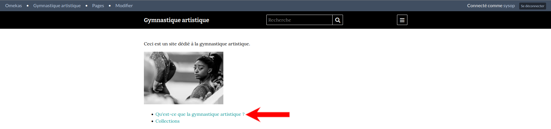
Site pages: display the list of all site pages where the item is attached.
Resource class: display the resource class of the item.
Values: display all item property values.
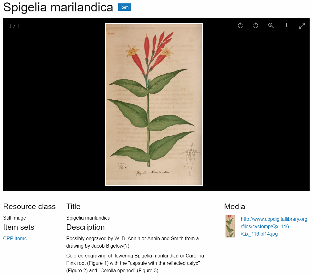
The image below displays the public item page in the Foundation theme, with the blocks set as in the screenshot above: Lightbox gallery in the Full-width main region; Values and Linked resources in the Main region; Media list in the Right sidebar region; Resource class and Item sets in the Left sidebar region.
Media page
Available blocks:
Lightbox gallery: show the media using the Lightbox gallery viewer.
Linked resources: display a filterable table of resources that are linked to the media.
Media render: show the current media.
Resource class: show the resource class of the media.
Values: display all media property values.
Item set page
Available blocks:
Values: display all media property values.
Resource class: show the resource class of the item set.